Cover slide introducing the Splitgate 2 Brand Style Guide—featuring core colors and signature background gradient.

Minimum size specifications for the primary logotype, designed for legibility across marketing formats.

Clear space guidance around the Splitgate 2 logo to ensure visual clarity and brand integrity.

Monochrome versions of the logo, optimized for high-contrast applications and accessibility.

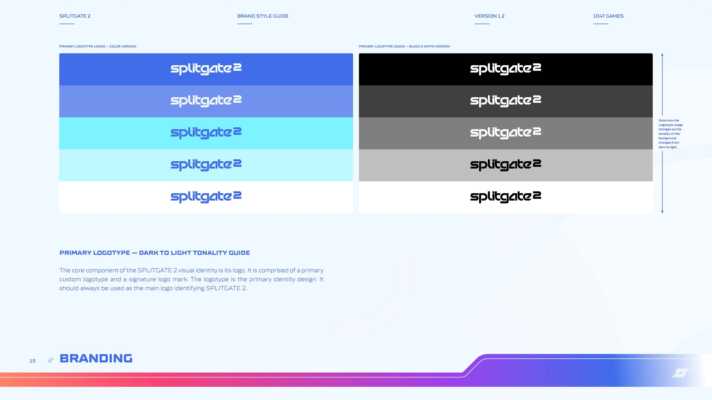
Flexible logotype usage across a dark-to-light tonality scale for diverse background integrations.

The primary gradient and faction-based color palette supporting the Splitgate 2 brand system.

Anatomy of the “S Portal” secondary mark—combining motion, symmetry, and the portal motif.

Technical rules for minimum sizing and safe zone of the secondary logo mark.

Custom type system featuring TT Supermolot Neue, with applications for headers, subheads, and body text.

Usage rules for headline structure, hierarchy, and sentence casing across brand communications.

Splitgate 2's graphic theme reflects a clean, future-sports aesthetic inspired by LED broadcast screens and event design, using gradients and herringbone motifs to express motion and energy.

The S Curve Graphic Shape appears as a large background or a footer bar, echoing the Splitgate 2 logo’s angles and creating a consistent motion-forward brand language.

This background motif forms cascading chevrons and “S” shapes at 45° angles—visually tied to the portal mechanic and reinforcing the brand’s dynamic identity.

Call-to-action and title boxes adopt the same 45° angularity as the brand system, with flexible color application across content, maintaining readability and strong brand alignment.

Designed for social and trailer use, video endcards integrate hierarchy, color palette, and logotype placement to deliver polished, brand-cohesive end frames.

Additional marks like the SOL Splitgate League logo and faction crests support in-game branding, promotional use, and narrative development within the Splitgate universe.

Introduces the core identity systems for the three founding factions: Aeros, Sabrask, and Meridian. Each has distinct branding, palettes, and narrative positioning.

Aeros champions a fast, stylish, and pleasure-oriented culture. Their philosophy centers on lived experience and aesthetics in a post-scarcity world.

The Aeros identity features a custom logotype and dynamic symbol, designed for modular use in faction branding across digital and physical platforms.

Demonstrates color variants and full logo lockups, showing how the Aeros identity adapts across light and dark backgrounds while maintaining visual integrity.

A look at the flexible identity system for Aeros, showing alternate logo treatments across faction colors for varied applications.

The core color system created to reflect Aeros’ energetic, entertainment-first identity, balancing neutrals and vibrant tones for versatility.

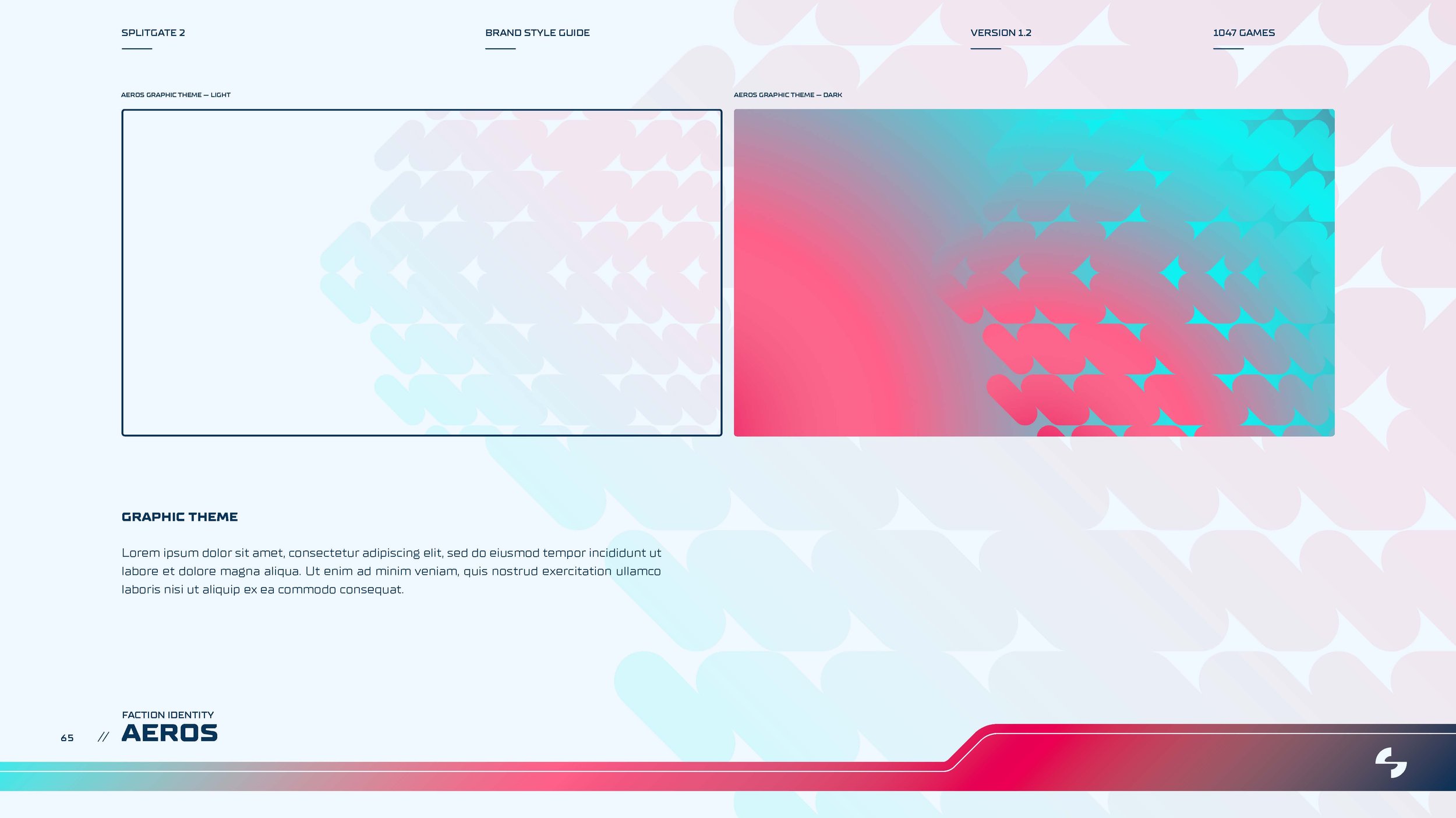
Paired light and dark background motifs inspired by futurist sports branding, providing context-rich backdrop designs for UI and content.

Faction identity applied to in-world content: an Aeros-themed weapon skin concept for the SSL-81 railgun, integrating graphic patterns and logos.

Introductory page establishing Sabrask’s militaristic, no-nonsense brand tone through color, form, and messaging.

A showcase of Sabrask’s main branding system, grounded in angular symmetry and power-forward geometry.

Two primary logo lockups demonstrate the faction’s brand presence across contrasting backgrounds and tonal contexts.

Secondary logo treatments designed for low-light, monochrome, or merch applications while maintaining faction legibility.

Color palette emphasizing strength and utility, built for high readability across desert, industrial, and in-game contexts.

Signature diagonal grid backgrounds for Sabrask, with light and dark versions that echo faction infrastructure and tactical environments.

Key art showcasing the Sabrask faction's applied branding in a seasonal promotional asset, reinforcing their militaristic identity and color system in a clean, commercial layout.

Introduction slide for the Meridian brand system, presenting a clean, tech-forward visual identity aligned with advanced AI and bionic themes.

Primary logo usage with structural grid background, illustrating the geometric foundation and corporate precision of the Meridian identity.

Dual layout exploring light and dark color applications for the Meridian wordmark, used across marketing and in-universe branding.

Primary symbol usage, demonstrating how the mark can live independently while retaining brand recognition through consistent geometry.

Color system balancing premium purples and tech neutrals with metallic gold accents—designed to scale across UI, apparel, and lore-based environments

Signature brand pattern with light and dark variants, optimized for background applications across merchandise, UI overlays, and environmental graphics.

Character-driven design asset for a season launch, combining Meridian’s core palette and grid styling with game narrative and product messaging.

A sample of fictional corporate logos developed for in-world narrative use, supporting the game's worldbuilding through manufacturing, optics, and tech sub-brands.

Brand identities for fictional armor manufacturers, reflecting varying tones from sleek military to corporate futurism, used across gear, UI, and promotional materials.

A sampling of in-universe logos created to reinforce the visual worldbuilding and technological identities of Splitgate 2's armor manufacturers.

Distinct branding for various fictional weapon manufacturers within Splitgate 2. These identities expand the narrative space and reflect each brand’s speculative tech ethos.


